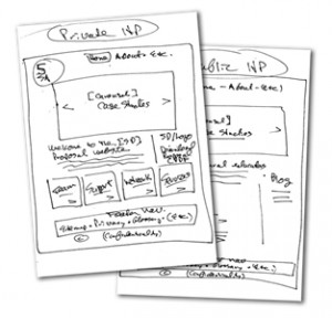
 As a content strategist working on website projects, I’m usually working with clients trying to launch new sites or redesigns as quickly as possible. Since websites are arguably the best media for establishing brand and communicating with customers and prospects, I can understand why companies want to move their projects along so quickly. All you have to do is write the copy, create the design, and then build, right? If only it were that easy. It’s definitely not – especially at the “wireframe” stage.
During website development, “wireframes” – simple, black-and-white line drawings — are usually where an information architect (no matter what his/her actual title) lays out content priorities, structure and navigation. They’re supposed to be rough drafts to review and test and redraw as often as necessary to get most of the user experience right before visual elements such as images, fonts and colors are added.
Unfortunately, on small web projects without a designated information architect (IA), a graphic designer assumes that role, often without realizing the full scope of an IA’s design responsibilities. The designer builds wireframes based on a rough idea of what a few top-level pages are supposed to do, basically biding their time until they can start doing what they know best: making the site visually appealing. Sometimes that temptation is too great and the designer skips wireframes entirely and jumps right to full-fledged, clickable mock-ups, often coded HTML pages with all basic graphic design elements included. Everyone then focuses on the “look and feel” instead of the usability–and a critical chance to pay close attention to the basic user experience is lost.
Even worse, often due to budget constraints, the project manager or designer limits the number of wireframes to a few common content categories and top-level navigation situations, assuming all other pages can be based on them. It is assumed these “templates” can be easily tweaked after the site goes live.
That’s a no-no.
I give you the founding gurus of Web information architecture, Lou Rosenfeld and Peter Morville, writing more than a decade ago: “The goal is to create wireframes not for every page in your site, but for the ones that are complicated, unique, or set a pattern for other pages (i.e. templates).”*
Note that setting patterns for other pages (templates) is only one of three purposes of wireframes! The other two are recognizing any “complicated” or “unique” pages and creating and testing wireframes for them too, just to make sure – before it’s too late – that they don’t become major stumbling blocks or dead-ends (read: exit pages) for the user experience. Seems simple, doesn’t it? Especially when you compare it to real-world architecture – you design and test a building’s structure and how each different room will be used before you decorate it and definitely before you start using it as a template for other rooms or buildings.
*Rosenfeld, Louis and Peter Morville. “Information Architecture for the World Wide Web.” Sebastopol, California: O’Reilly & Associates, 2002 (2nd Edition).
———————–
John Howe is a guest blogger for RHetoric. Learn more about John at http://wyriwyg.com/.

